

Following on from my previous article about trend-proof digital design strategies, this week I want to talk about a small thing: brevity – and the big implications it has for communicating a proposition effectively.
This article isn’t about UX strategies for basket-to-checkout ecommerce or media publishing websites and apps. They carry their own set of UX optimisation challenges. What I am writing about is a challenge familiar to many businesses of any size and across all sectors. How do you communicate the value of your offer to an online audience who often have a rather limited attention span?
A bit more about those attention spans
“If only we could return to pre-smartphone attention spans and people could take the time to read my content properly!”, I hear you say.
Whether or not it was easier to get people’s undivided focus prior to the iPhone is questionable, but if we look beyond newspaper headlines decrying the collapse of global attention spans, we nevertheless find a number of important takeaways around what we can and can’t expect of people when they are reading your content.
Believe it or not your users may not be reading your content purely for fun. The context in which people are visiting your site is likely to be heavily time-limited in some way (e.g. a solitary hour they’ve set aside to research a list of potential suppliers for their line manager, or maybe a social advert they’ve clicked on while they were more interested in scrolling down their news feed).
When users are on your site for the first time they will be in a mode of thought we would categorise as ‘unfamiliar’. This is the time where they will be having to think more intensively and weigh up the benefits you might be able to offer them. And that’s hard work.
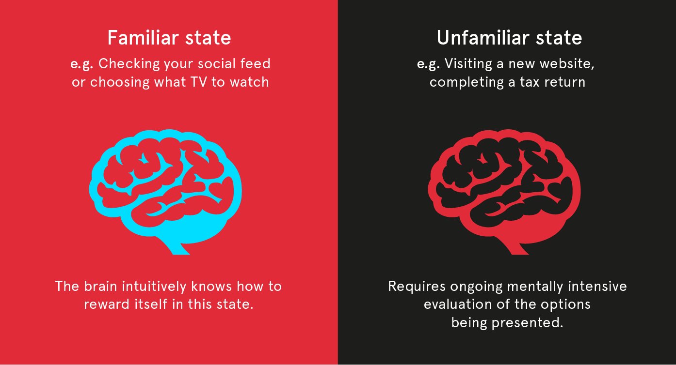
Attention has to be earnt. As individuals we have complete ease and freedom to access online information, all with no compulsion to engage with it any longer than we feel we want to. This might sound obvious, but what it means is that if you make too many demands of a user’s brain then they are going to reject what you’re trying to tell them very quickly.
So regardless of whether or not the latest research suggests you have eight or ten seconds to get a user to engage with your website before they hit the back button, you do face a very real challenge in communicating your offer and keeping traffic on your site.
Enter ‘progressive disclosure’ (Getting technical)
Progressive disclosure has been around in UX and application design for a long time. As a concept it refers to placing less frequently accessed functionality or information in a secondary place – out of immediate view – usually because they are more complex in nature or less likely to be used.
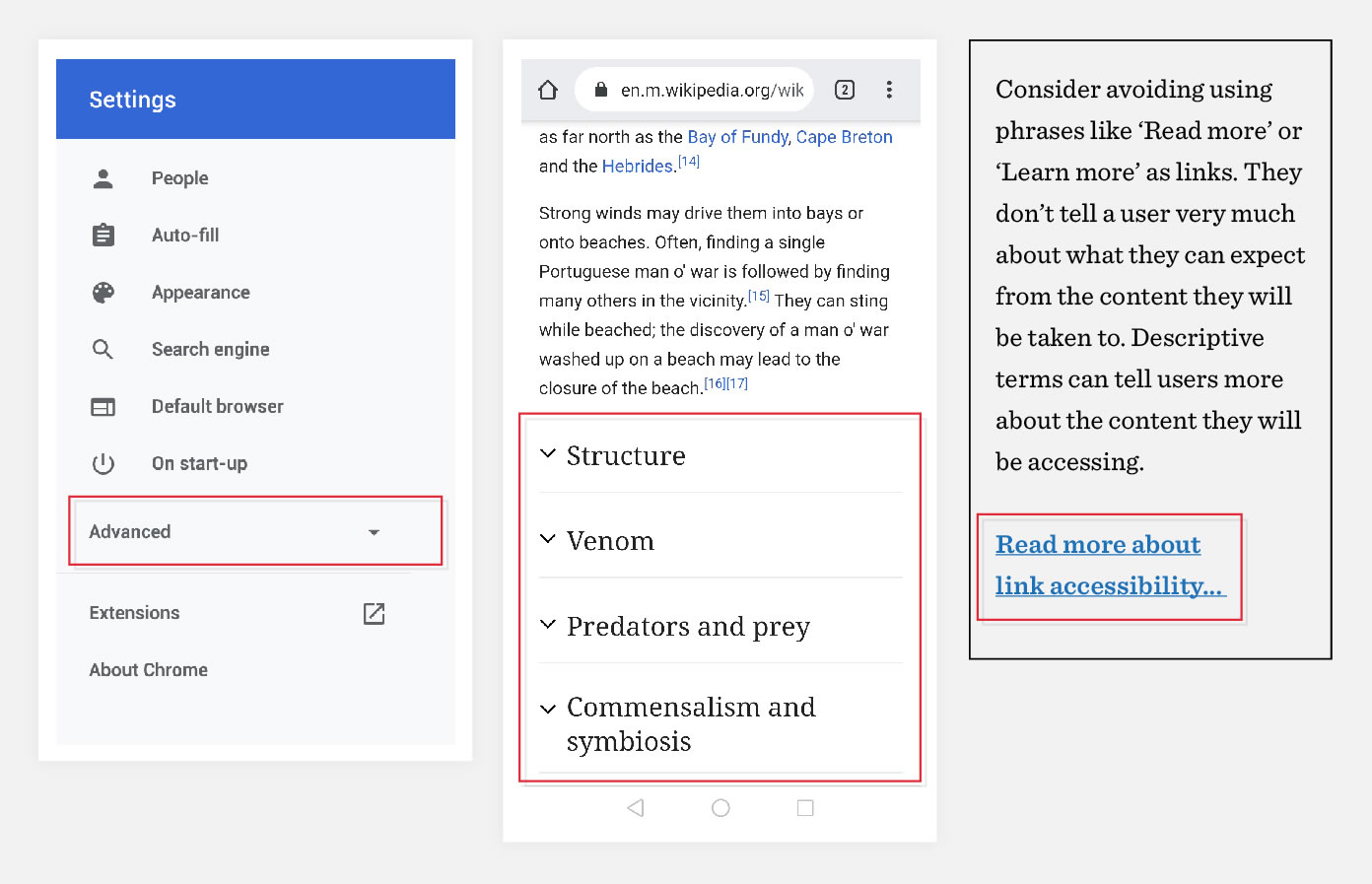
You will already be familiar with many kinds of progressive disclosure from your use of websites and apps. Think about toggling the open and closed state of accordions? How about those helpful tooltips on a web form? Even selecting a ‘Read more’ link. These are all examples of progressive disclosure.
The argument I would make is that rather than see progressive disclosure as a niche area of UI design and usability, it’s actually a great metaphor for the overall experience we should bring to any website that needs to successfully manage the balance between the level of information that someone might conceivably want to know vs what most people will be willing to read.
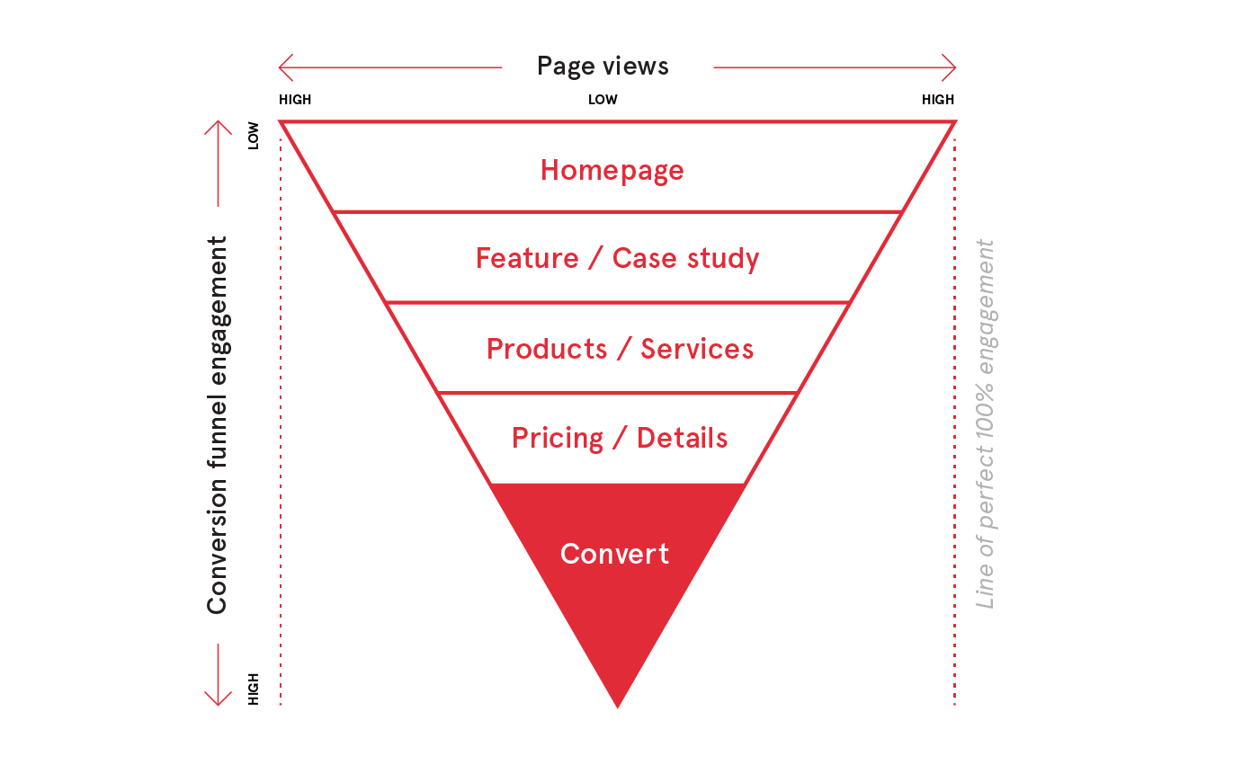
Seen as a diagram, we can see that the deeper into a conversion funnel (or user journey) we go, the greater the barrier to entry to visitors as they try to navigate more detailed information that requires them to think harder and make real value judgements.
Hit your visitors with something either overly comprehensive or densely presented and you will be creating psychological hurdles for people that large percentages of your traffic won’t be willing to engage with or go beyond.
What it means in the real world
A prospective customer’s first visit to your website is the point at which they mentally validate your business – the scale and level you operate at, as well as whether you feel like the right personality fit for them. Just as we do with people we meet, rightly or wrongly, these are all value judgements that we will make instinctively and almost instantaneously.
Your prospects and customers might want to know more about you, but, just as in real social interactions, they want to first feel comfortable with who they’re listening to if they are going to stick around to hear the rest of what you’ve got to say.
Some gold-standard strategies for boosting engagement with your content
Headlines and text
This aspect of optimising your content is worthy of a blog post all of its own. The guidelines below apply largely to websites and customer applications.
Do… Keep headlines as short as you can, but if you need longer statements, you should stick to the speak-easy approach. Use familiar and common words that can communicate a value or benefit at a human level.
Don’t… ignore what is comfortable for the human eye to read. On a responsive website you need to pay attention to text size and line length across the full range of screen widths your content will appear at.
Research suggests around 50-75 characters per line is optimal for desktop resolutions where our eyes are further away from the screen, but on smaller screen sizes (such as on mobile devices) that can drop a little lower as we are more likely to be using the screen as a similar distance as say a printed book.
Do… be absolutely ruthless with the length of text you assign to sub-headings or one sentence descriptors. Think 50-80 characters tops. It will also help prevent your page designs from looking dense and unattractive. Setting clear guidelines with copywriters and striving for the most precise and concise iteration of a message is critical.
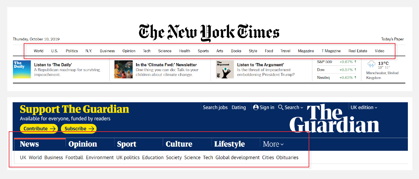
Break your content up and find repeatable patterns
You need to be mindful that users will interact with your website in an entirely different way to how they interact with a linear publication.
A good UX designer knows that there will be many different entry points for first time visitors to your website. They will know that your content needs to adopt the mindset of a 10 second pitch not just on your homepage, but also on your key landing pages – which can be highly significant entry points for SERP referral traffic depending on your keyword relevance.
Try to:
Avoid thinking about your content as standalone ‘pages’. Think about how you would condense the value of a service or offering into a six word headline, a set of bullet points or a 40 character descriptor sentence. Prioritising highly concise value/benefit led copywriting is part of any successfully implemented user journey for content rich websites.
Steer clear of large passages of text unless you are presenting a full article. Your landing pages and product/service pages should break your content down into clearly labelled and visually defined areas on the page. In essence, you need to visually reward people and create clarity and contrast as they assess what information is relevant to them.
The Hick-Hyman Law and simplifying user’s choices
First posited in 1952 by a pair of British/US psychologists, this principle tells us that decision making suffers when we are presented with too many choices. This is not an unfamiliar feeling for the average consumer!
In the context of digital experiences, if you find that you have an extensive list of services, products (or anything else) to list on your website, remember that there’s no written or unwritten rule out there that says they deserve equal presence or weighting on your page layouts or navigation.
In screen based interactions, when we are presented with too many options our brains will struggle to visually and cognitively process what’s important.
Use of a prioritising design strategy vs a non-prioritising one.
In the real world, businesses have products and services that are more successful, provide a better profit margin, or are simply more in demand than others. In bricks and mortar retail this really is lesson 101.
So consider how your layout and navigation can be segmented into ‘tiers’ of content priority, guiding traffic towards your key products and offerings.
Putting it into practice
The first thing we do in any project is to sit down with our clients and workshop the priority communication objectives for their online presence. We use the techniques described in this document (amongst others) to work to create a detailed content and UX strategy that clearly articulates their proposition as part of a defined user journey.
But you certainly don’t need to be experts in UX or design to get the basics right. Follow some of the tips highlighted in this article and see what it can do for your online engagement.
Next time
For my next instalment, I’m going to be delving into an often under-acknowledged area of the digital designer’s craft – how careful use of aesthetics and visual character can powerfully influence how we feel about companies and organisations.